Image location
With the huwindty starter, images are stored within the content (after all, images are content too). They can be added in any folder and their url will always be relative to the pages folder which is the root folder for the content.
example image

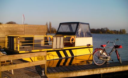
For example, the image above (boat.jpg) is located in the /src/pages/documentation/ folder and is used by a page in the same folder. The url used to show it on the page will be /documentation/boat.jpg. Always use an absolute url for the image source (starting with a /).
Responsive images
Web pages can display on a small phone screen or a large high definition monitor. Displaying a 3000px wide image on a phone is a waste of resources that slows down display and showing a 150px picture on a wide monitor might miss some details. Making images responsive is the way to provide the appropriate picture to each screen.
The article Responsive images 101 covers everything you need to know about this topic when managing a web site.
Default choice
In this template, the eleventy config provides a way to generate responsive images and store them at the right place, as well as generating the right responsive code to use them (see .eleventy.js). Image sizes and format can be adjusted according to your layout and needs by changing the Images enum at the beginning of .eleventy.js:
const Images = {
  WIDTHS: [426, 460, 580, 768, 1200], // sizes of generated images
  FORMATS: ['webp', 'jpeg'], // formats of generated images
  SIZES: '(max-width: 1200px) 70vw, 1200px' // size of image rendered
}
On markdown pages it will be done directly while parsing the markdown code thanks to the mdLib.renderer.rules.image rule.
On pure HTML pages, you will need to use a specific shortcode defined in eleventyConfig.addShortcode("Picture" and provide several options. Only the alt tag is compulsory, but you can also override the default width and formats of your image to fit with the specific design of your HTML page.
Responsive Images in HTML pages
To get a step by step understanding of what the eleventy-img plugin is used to create a shortcode that generates the images and provides the right code You can read How to optimize images on eleventy (11ty) which was freely adapted to Huwindty. You may want to add the lazy-loading and the blurry effect if you want.
An example is available on the Huwindty home page
    {% Picture page, "vera-davidova.jpg", "Photos of high grass dancing in the wind at the golden hour", undefined, undefined, undefined, undefined %}
    <!--
    Picture attributes:
    page, file name, alt text, class, widths, formats, sizes
    -->
The atributes are the following:
- page will provide the current path to generate the right output path. Just leave
pageafter thePictureand this will be fine - file name: On this example there is no path to the current image file since they are in the same folder.
- alt text is made compulsory for various reason, I also encourage you to write nice descriptive text that really help blind people to understand your image.
- class will add a css class to the image so you can change its position and dimension. The specific class
lazywill also make the image lazy load. - widths will override the default widths in with the output images will be generated. this is particularly useful if you change the size of the image using a css class, you will want to generate images with the same size.
- formats will override the default formats
- sizes will override the default sizes to tell the browser how large the image will be ahead of its complete download. The default is 100vw but if you know your image will display on half of the page you may want to change this to 50vw.
Responsive Images in Markdown
For Markdown, we implemented what is explained in Responsive Images in Markdown with Eleventy Image, a nice step by step blog post explaining how to use mardown-it to parse normal image code in markdown to generate the responsive image HTML code thanks to eleventy-img.
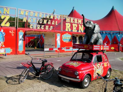
The image below is generated with the simple code
{.lazy}

When you inspect the code, you see that the generated code is the following responsive HTML:
<picture>
    <source type="image/webp" srcset="/documentation/images/circus-350w.webp 350w, /documentation/images/circus-700w.webp 700w, /documentation/images/circus-750w.webp 750w, /documentation/images/circus-1200w.webp 1200w, /documentation/images/circus-1500w.webp 1500w, /documentation/images/circus-2000w.webp 2000w" sizes="(max-width: 400px) 380px, (max-width: 470px) 450px, (max-width: 841px) 640px, (max-width: 1100px) 640px, 764px">
    <img alt="drooderfiets and red circus" class="lazy" loading="lazy" decoding="async" title="" src="/documentation/images/circus-350w.jpeg" width="2000" height="1500" srcset="/documentation/images/circus-350w.jpeg 350w, /documentation/images/circus-700w.jpeg 700w, /documentation/images/circus-750w.jpeg 750w, /documentation/images/circus-1200w.jpeg 1200w, /documentation/images/circus-1500w.jpeg 1500w, /documentation/images/circus-2000w.jpeg 2000w" sizes="(max-width: 400px) 380px, (max-width: 470px) 450px, (max-width: 841px) 640px, (max-width: 1100px) 640px, 764px">
</picture>
Lazy loading
Lazy loading images defers their loading on the page until they are actually needed, instead of loading these resources as soon as the page loads. This improves initial page load performance and enhances user experience.
It is not recommanded to lazy load images that are visible on screen when the page loads (below the fold) but it is possible to differ images that are lower on the page. They will then be loaded as the user scrolls down.
Because of that, all images can’t be lazy loaded by default. Instead, content editors can intentionally request lazy loading by adding "lazy" as a css class. The responsive image script will add loading="lazy" in the output code.
The makrdown example above shows you how to add this class to an image in markdown.
Images in CMS
This starter comes with the simple Svetlia CMS that allows you to add, remove and update pages and media. Images in Svetlia CMS can be added in two ways:
- in a dedicated media folder
(All images are available for all pages) - in the folder of the current page
(Images are not reusable in other pages)
Because the CMS uses Markdown and that images in Markdown are automaticaly converted in responsive pictures, there is nothing else to do other than choose well your images, organise them, and never forget the alt text.
Thumbnail
The thumbnail of a page is defined in the front matter. For example the current page has:
thumbnail: boat.jpg
This is the image that is shown in the list of pages in the CMS interface. It is also used as the metadata image of the page. This is the image that is used in the generated snipet that you see when you copy the url of the page in social medias.